Introduction
This article describes how to compute substitution maps, which allow an exploration of differences between alternatives (e.g., different products in a market or different levels of an attribute).
Requirements
- A document containing a Latent Class Analysis, Hierarchical Bayes or Ensemble Choice Model output created in Q.
Method
Step 1: Create a switching matrix
The first step is to create a switching matrix. A switching matrix typically shows brands switching (e.g., what proportion of Ford buyers next buy a Ford, versus BMW, versus General Motors, etc.). A switching matrix can be created from a conjoint choice simulator by first computing share predictions for some base scenario (e.g., current market conditions), making one of the alternatives less desirable (e.g., by raising its price), and seeing how its share changes, and then repeating this for the other alternatives. In the table below, each row shows the proportion of people who switch from a cuisine when its price is raised from $10 to $20 per meal. Looking at the first row, for example, we can see that 37% of Pizza choosers will continue to choose a pizza if the price is doubled, 16% switch to Chinese, etc.
While you can create a switching matrix by entering the scenarios and writing the numbers down, you can save a lot of time by using code to record the different scenarios. In Q, this is done by
- Using Create > R Output,
- Pasting in the code below,
- Changing the first five lines to refer to the data of interest. A good tip when creating such a matrix is to always order the rows and columns according to market share or preference share, as it tends to make key patterns more obvious.
alternatives = c('Chicken', 'Chinese', 'Hamburgers', 'Indian', 'Mexican', 'Pizza', 'Thai')
base.price = '10'
high.price = '20'
price.attribute = 'Price per person'
model = choice.model.final
k = length(alternatives)
scenario = list()
for (a in alternatives)
{
scenario[[a]] = c(base.price, 'Cuisine' = a)
names(scenario[[a]])[1] = price.attribute # Adding name to price
}
base.share = colMeans(predict(object = model, scenario = scenario), na.rm = TRUE)
shares = matrix(NA, k, k, dimnames = list(alternatives, alternatives))
for (a in alternatives)
{
scenario[[a]][price.attribute] = high.price
share = colMeans(predict(object = model, scenario = scenario), na.rm = TRUE)
shares[a, ] = share - base.share
scenario[[a]][price.attribute] = base.price
}
diag(shares) = base.share - (rowSums(shares) - diag(shares))
shares = sweep(shares, 1, base.share, FUN = "/") # Expressing as row %
o = order(base.share, decreasing = TRUE)
shares = shares[o, o] # Reordering from highest to lowest
switching.matrix = shares
Step 2: Compute switching shares
The main diagonal of the switching matrix shows loyalty. We can see that 37% of Pizza choosers stayed loyal despite the $10 price rise, 30% of Chinese choosers were loyal, 38% Mexican, etc. In the table below, the loyalty data has been removed and each row has been re-based to add up to 100%.
x = switching.matrix
diag(x) = 0
x = prop.table(x, 1)
diag(x) = NA
switching.shares = x
Step 3: Compute magnetism
The key feature in the table above is that the numbers in each column are relatively similar. For example, all the numbers in the Pizza column are in the range of .21 to .51, whereas in the right-most column, most values are less than 0.03. Such a pattern is the norm in switching data. We can thus simplify this table a lot by just using the average of each column, which we can refer to as an alternative’s magnetism.
x = colMeans(switching.shares, na.rm = TRUE)
magnetism = rbind(Magnetism = x)
Step 4: Index the switching shares
The next table divides each row of the switching shares by the alternative’s magnetism. This produces a table where the higher the value, the greater the degree of switching (substitution) if the magnetism is equal. That is, this table reveals the switching that cannot be explained by magnetism alone. For example, reading down the second-last column of the table, we can see that ignoring magnetism, Thai is most likely to be substituted with Indian, followed by Chinese.
switching.rates = sweep(switching.shares, 2, magnetism, FUN = "/")
Step 5: Using multidimensional scaling (MDS) to summarize the indexed switching shares
MDS is useful tool for summarizing tables like the one above. In order to use MDS, we need to convert the table into a distance matrix, where bigger numbers indicate alternatives are further apart. There are two aspects to doing this:
- We need to make the table symmetrical around the main diagonal. That is, the Indian-Thai switching is 3.13 and the Thai-Indian switching is 3.87, and if we replace each of these values by their mean of 3.5 we create a symmetrical table. In the code below I’ve computed the geometric mean to take into account that the underlying data are ratios, but the difference is trivial. In the case of Thai-Indian, the geometric mean is 3.48.
- Taking the inverse of the values, so that we have smaller values for alternatives that are more similar.
x = switching.rates
x.log = log(x)
x.symmetrical = exp((x.log + t(x.log)) / 2)
distance.matrix = x.symmetrical ^ -1
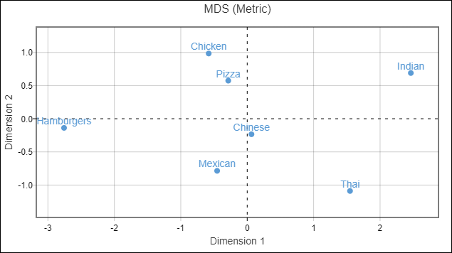
The plot below shows the results of metric MDS applied to the table above (In Q: Automate > Browse Online Library> Dimension Reduction > Multidimensional Scaling, and selecting the distance.matrix created above as the Distance matrix.) This produces the map shown below. As is often the case with MDS, quite a lot of information is lost from the data due to the impossibility of showing all the information in the plot (the data requires six dimensions to be accurately described, but MDS plots only two). For example, the table above shows us that Thai and Indian are very strong substitutes, and we might anticipate that they would be on top of each other. However, Thai is also reasonably close to Chinese and Mexican, whereas Indian is a long way from each, so the resulting plot is a compromise of such effects. The biggest compromise to call out from the plot relates to Hamburgers, which are very similar to Pizza, Chicken, and Mexican, but not to Chinese, whereas each of Pizza, Chicken, and Mexican are close to Chinese, which again leads to a compromise position for Hamburgers. This emphasizes that while this plot is a useful summary of overall patterns, it is not the whole story.
Step 6: Creating the substitution map
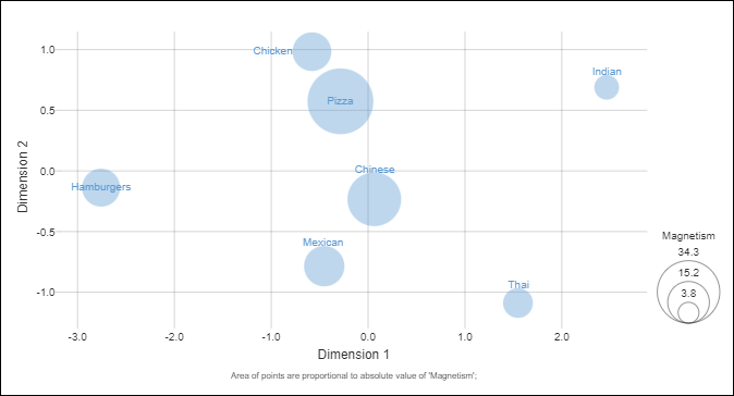
In the final step I’ve created a bubble chart, using the coordinates identified from the MDS, with the size of the bubbles proportional to magnetism.
To create the substitution map in Q,
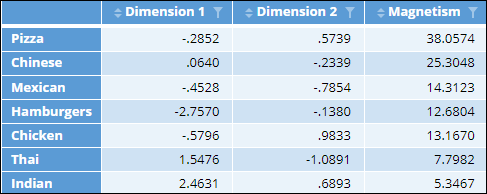
- Create a table that contains the coordinates from the MDS and the magnetism.
- Use Automate > Browse Online Library > Visualization > Scatterplot and select CHART > APPEARANCE> Show labels > On chart. The code for creating the table is shown below.
out = cbind(mds$embedding, t(magnetism) * 100)
colnames(out) = c("Dimension 1", "Dimension 2", "Magnetism")
substitution.data = out

See Also
How to Create an Experimental Design for Conjoint Analysis
How to Format Data for Running Conjoint in Q
How to Use Indifference Curves to Understand Trade-offs in Conjoint Analysis


