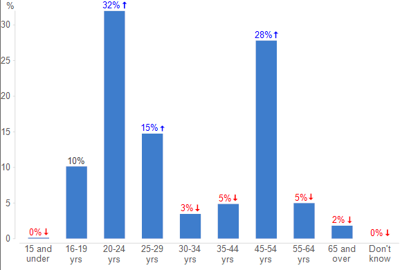
This article describes how to create a chart using a QScript:

Requirements
- The importdata.zip file which includes the Phone data set that we will use for this article.
- You have read How to Create a Custom QScript, How to Work with Variables via QScript and How to Add Folders and Text Outputs via QScript.
- You are using one of the methods from How to Use QScripts in Q.
Method
In Q, the project's Report tree is referenced as the project.report object. You can append various objects to your report, including charts (from Create > Charts > Chart) and visualizations (from Create > Charts > Visualization).
Basic charts
The general workflow for creating a basic chart via QScript is to either first add a folder and then insert a chart on it, or else add a chart directly to the report. In this example, we will create a Column chart based on our Age variable crosstabbed by Gender and add it to a new folder:
// Declare variables
var report = project.report;
var data_file = project.dataFiles[0];
var age = data_file.getQuestionByName("Age");
var gender = data_file.getQuestionByName("Gender");

// Add folder
var folder = report.appendGroup();
folder.name = "Charts";

// Add chart
var chart = folder.appendPlot("Column chart");
chart.primary = age;
chart.secondary = gender;
chart.size = [150, 75];
- We begin by declaring our report and data file as variables that can be used later.
- We then get our Age and Gender
questionobjects from our data set usinggetQuestionByName. - Next, we append a folder to our report with the name Charts.
- Finally, we use the
appendPlotfunction to insert a column chart on our page by specifying the primaryquestionfor the rows, secondaryquestionfor the columns, and the size of the chart in pixels.
Note, to do the same without adding a folder, we could write the following:
// Declare variables
var report = project.report;
var data_file = project.dataFiles[0];

// Add chart
var chart = report.appendPlot("Column chart");
chart.primary = age;
chart.secondary = gender;
chart.size = [150, 75];
The main difference here is that appendPlot is appended to report.
An alternative to specifying the chart type is to use appendPlotAutomatic which will select the chart type automatically based on the data structure. In this case, we can add the primary and secondary arguments within an array inside the function:
var chart = folder.appendPlotAutomatic([age, gender]);
Note, the appendPlot and appendPlotAutomatic methods are only applicable for non-R-based charts found under Create > Charts > Chart or in the Show Data as chart options in the toolbar above each table.
R visualizations
An alternative approach is to create an R-based Column chart by replacing the last section of code with the below:
var chart = folder.appendVisualization("Visualization - Column - Column",
                                           {"formX": age.variables[0].guid});
chart.update();
- Here, we instead use
appendVisualizationand specify the chart type by entering the menu structure under Create > Charts > Visualization separated by a dash. - We can then reference the Input JavaScript control for storing variables,
formX, and pass the unique guid of the Age variable. - To ensure the underlying code has been run upon loading, we force
chartto calculate by usingupdate().
Optionally, you can also specifically select the chart after the above code has run:
project.report.setSelectedRaw([chart]);
Next
How to Modify Tables via QScript
See Also
How to Work with Variables via QScript
How to Add Folders and Text Outputs via QScript
How to Create a Custom QScript