New to Q? We’ll walk you through the basics, so you know what to expect along the way.
Data is nothing without you to find the story. Discover it easily with Q.
Welcome to QNo matter your expertise level, Q will make your job easier. If you’re newer to market research, welcome! With no painful syntax or code to learn, analysis and reporting is a breeze. Follow these instructions and you’ll be up and running in no time. If you’ve been around the block a few times and you know your stuff, you can easily do all your analysis in Q from Max-Diff to Conjoint to working in R. Be an even better researcher. |
Adding your data set
This section is all about the all important first step – adding a data set. If you’ve got one ready to go, awesome! Want to explore Q but don’t have a data set handy? Use ours!
Let’s start your first project in Q. Add your data set by clicking:
File > Add Data Sets > Add to Project > From File
Q is pretty flexible and works with lots of different file formats. But the simplest format to use is a .sav file. Luckily, most survey platforms will have the option to save as a .sav file.
Data file formats you can use in Q
Automatically detect data file structure – huh?
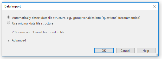
When you add a data set to your Q Project, a Data Import message appears (see the image below). Don’t worry if this is confusing! Click OK.
It just means that Q will group your data into questions (e.g., Age, Preference, Awareness) and format it for you (e.g., single response or multiple response, list or grid, percentage or average or text etc.). Pretty handy, right?

Once you’ve added your data set to your Q Project, you can start creating your summary tables. At the top of your screen, you’ll find blue and brown drop downs.
The blue drop down contains all the questions from your survey. Select a question (e.g., Age) and then you can tell Q how you would like your data to be displayed using the brown drop down.
For most questions in your survey, the brown drop down defaults to Summary, meaning that Q will create a summary table for you.
|
TIP: You can use the brown drop down to show your raw data or tell Q to create a crosstab |
Crosstabs
Did you know you can create thousands of crosstabs at once?!? Oh yeah!
Simply click:
Create > Tables and select either Banner Tables or Lots of Crosstabs.
To manually create a Banner:
Create > Banner > Drag and Drop
To save the tables you will want to export or use for a report, click ![]()
You’ll see your saved tables appear in a Report Tree on the left side of your tree. Ta da!
|
TIP: Right click on a folder to add additional folders, text, charts and tables. |
Table Options
Merging categories
Want to merge categories together? Or create a top two box score?
To merge two categories, just drag the row or column you want onto another one and release when the tool tip says Merge.
To merge multiple categories, simply hold down Ctrl and select the categories you want to net together, right click and select Merge.
If you would like to keep your original categories but want to Net some to create a new additional category, you can! Simply hold down Ctrl and select the categories you want to net together, right click and select Create Net. Presto!
|
TIP: It’s a good idea to Right Click > Duplicate Question here so you’ll have two version of the same question. |
More right click magic!
The right click menu contains lots of cool time savers from adding stats to your table to creating weights and renaming categories. The most common uses of the Right click are:
To add statistics to your table (e.g., N, base sample, an average);
Right click > Statistics – Cells
Right click > Statistics – Right
Right click > Statistics – Below
To create a Filter (use Ctrl to select as many categories as you want in your filter):
Right click > Filter
To create a Weight (super-cool if you need it):
Right click > Weight
To rebase a question or to change the values or labels in a question:
Right click > Values
|
TIP: You can Revert questions to their original state: Right click > Revert or |
Significance testing made simple
You might see some of your numbers highlighted red or blue with an arrow next to them. Don’t panic! This means that Q has found some statistically significant differences in your data.
Here’s your cheat sheet:
Blue means statistically higher. Red, statistically lower. The P-Value is shown at the bottom right of the screen. The arrows show the strength of that difference, with longer arrows showing a greater difference.
We don’t recommend changing any of the statistical assumptions, but if you would like to, click Edit > Project Options > Customize > Statistical Assumptions.
>To change the way significance is shown, locate the Show Significance Drop Down at the top of your screen and select Compare columns.
|
TIP: Help > Interpret this table. |
Telling your story: exporting with one click
Market researchers used to export their analysis to Excel, format it and then transfer it to PowerPoint. Not anymore!
Just hold down Shift, select all the tables in your Report, click on the PowerPoint icon ![]() at the top of your screen. Leave the defaults as they are and click OK.
at the top of your screen. Leave the defaults as they are and click OK.
|
TIP: You can:
|