Why rely on others to do your advanced analysis when it's so easy to do in Q?
How you can easily do advanced analysis in Q.
Correspondence analysis, Segmentation, Key driver analysis, MaxDiff, and so many more advanced techniques are easy to use in Q. Because Q guides you through every step and makes many of the tricky decisions for you (we call this Smart Systems).
Here, you’ll discover how to easily do:
|
Want to explore advanced analysis in Q but don’t have a data set handy? Click here to use ours!
Advanced analysis – where is it?
In Q102 you discovered how to automate your grunt work. Here we up the ante and show you how easy multivariate analysis in Q can be.
Most of the advanced analysis options can be found in Q under the Create menu. Less common options (e.g., TURF) can be found under the Automate menu and even more obscure advanced techniques can be done by using R (Create > R Output). Everything is possible.
While you can do almost any advanced analysis technique in Q, here we show you how to do two of the most common: Correspondence Analysis, and segmentation with Latent Class Analysis
|
TIP: Check out the Q Wiki to explore other techniques. |
How to do correspondence analysis in Q
When crosstabs get too big, they become hard to read. Correspondence analysis is used to convert these difficult-to-read tables into perceptual maps. These maps make it easy to spot relationships in the data.
For example, try to summarize the findings from this table…

In this post we will show you how to do correspondence analysis quickly and easily with both a traditional scatterplot, and with the easier-to-read moon plot.
Correspondence Analysis with a traditional scatterplot
If you don’t have your own data, click here to download ours.
Step 1: Open your data in Q and select the question or questions you want to analyze in the blue dropdown (and brown dropdown if you are analyzing a crosstab).
Step 2: At the top of the Q window, select Create > Dimension Reduction > Correspondence Analysis of a Table.
Note that a new menu appears on the right side of your screen.
Step 3: In this new right hand menu, you need to connect the table you just created to the Correspondence analysis. To do this, click on the dropdown called Input Tables(s) and select the table you created in Step 1.
Step 4: Click the red Calculate button that’s on the right of your screen. While you are there, click the Automatic checkbox (this means that all your analysis will re-run automatically when the input data or options change – like when you update a tracker).
Step 5: Tidy your map by dragging it to the correct size and moving around the labels.
Step 6: Export it to PowerPoint using the PowerPoint icon on the main toolbar.
The challenge of using a traditional scatterplot for correspondence analysis is in interpreting it correctly. The best way to interpret the perceptual map is to draw a line from the brand to the center of the map. Then draw a line from the centre of the map to the attribute. Then measure the angles. Those with the smallest angles have the strongest relationships.
Or if you want an easy to read visualization, with no need to measure angles… try viewing your data as a moonplot.
|
TIP: Correspondence analysis easily be used on different types of data (counts, percentages, averages, multiple-response grids etc.). The data just needs to be on the same scale. TIP: You can change your title, colors, fonts, and gridlines using the Input settings on the right. Remove rows and columns you don’t want (e.g., None of these) by typing the labels into the Rows and Columns to Ignore boxes. |
Correspondence analysis as a MoonPlot!
Follow all the steps above and then:
Step 7: Click the Output dropdown and pick Moonplot. Make sure the Automatic checkbox (next to the Calculate button) is ticked.
Step 8: Read the warning that appears: “’It’s good practice to set Normalization’ to ‘Row principal”. And then click on the Normalization dropdown and pick Row Principal.
What does it mean?
It is so intuitive that you probably don’t need to read this. But here goes:
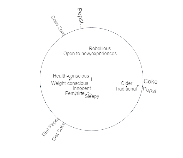
- The attributes sit around the circle. The bigger the font of an attribute, the bigger a driver it is.
- The brands sit inside the circle. The closer to the middle, the more generic, the closer to the edge, the more differentiated that brand is.
- The closer a brand sits to an attribute, and the bigger that attribute is, the more that brand is differentiated on that attribute.
Why we love Moonplots more than perceptual maps (sorry maps)
- They are less cluttered, which makes it easier to see which brands’ positions are strong.
- The varying font sizes indicate how the attributes differ in importance.
- Most importantly, the obvious interpretation of the Moonplot is the correct one. Easy! Goodbye rulers, protractors, calculators …
Interpreting the tree diagram
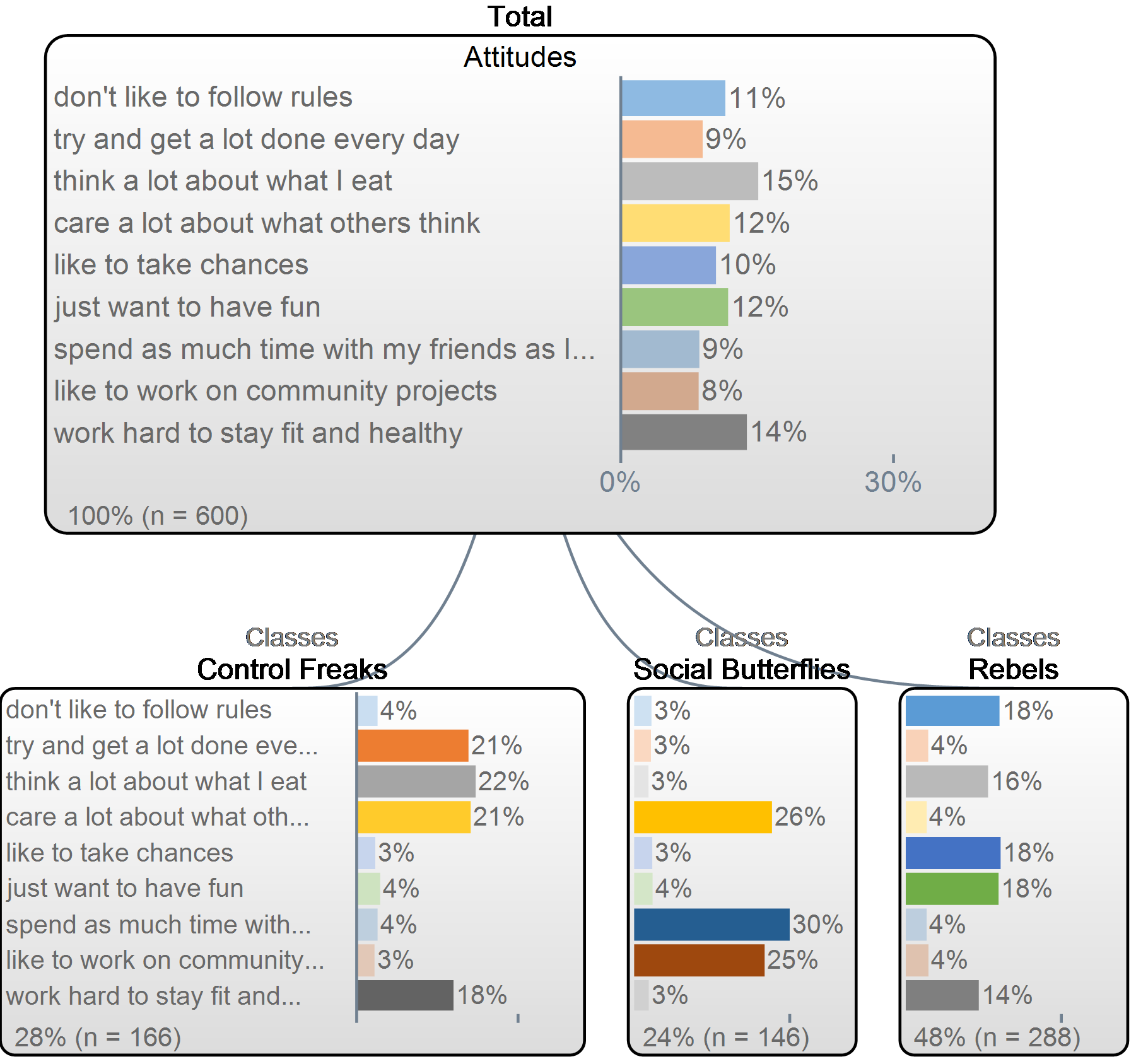
The latent class analysis produces two key outputs. The first is a tree diagram (check out the image below). This shows how the respondent data varies by segment. The top bar chart shows a summary of the total sample and the level under that shows how each segment differs. Right click on each segment and give them a name.
In the example below, Attitudes can be broken into three segments: Control Freaks, Social Butterflies and Rebels.

The second key output is a new variable which contains the segment for each person.
Right click on the Report tree and select Add Table.
Select Segments in the Blue drop down menu.
You can use Segments in a crosstab to see how the people in your segments vary on other questions and you can feed it into other analyses.
Why we love Latent class analysis
Latent class analysis is almost always preferable to any other segmentation algorithm. Here are some reasons why:
- It is able to accommodate lots of different types of data. For example, it can be used to create segments using combinations of categorical, numeric and other more exotic types of data, whereas most programs developed for the other algorithms can only accommodate numeric variables.
- It can deal with missing data in a sensible way, allocating people into segments based on their available data, whereas the standard implementations of the other algorithms only work with no missing data.
- It can accommodate weights. Other algorithms generally ignore weights.
- Latent class models are built upon many decades of statistical theory.
Profiling your segments
You can use Smart Tables to quickly see if any of the questions in your survey are related to your segments.
- Go to: Create > Tables > Smart Tables.
- Select Segments in the Blue dropdown menu at the top of the box called Dependent Variable. Select all the questions in your questionnaire (or at least all your demographics) into the Independent Questions box. Click OK.
Q has now grouped all the questions in your questionnaire into two groups: those that are statistically related to your Segments and those that are not. Those that are related are then ordered in terms of how strongly related they are.
