Export quickly to PowerPoint, in your company template!
Save on time and error by exporting editable charts directly to PowerPoint
You have two options when directly charting in PowerPoint: Exporting as an Excel Chart or as a Microsoft Graph. The Excel chart option actually works better in PowerPoint as it has more design options and is easier to access the underlying data – so always use that one.
The instructions below will first show you how to export charts and tables from Q to PowerPoint. Then they will show you how to set up chart templates in your company colors and fonts, so you can directly export using them.
Exporting Tables from Q
A few clicks will take you from analysis to editable, formatted chart in PowerPoint.
- Open your PowerPoint template (if you have one) or set up the backgrounds for your PowerPoint slides.
- When you are in Q, add all the tables you would like to export to PowerPoint to your Report Tree by clicking the + button.
- Hold down Shift and select the tables you would like to export. Then click the Export to PowerPoint button, which is on the top toolbar.
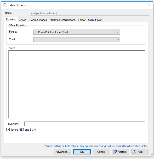
- In the dialog box that appears, make sure the Format is To PowerPoint as Excel Chart and the Chart drop-down is left Blank (if left blank, Q will figure out the best chart type for your data. You can override this in the drop-down – or you can change the chart type later in PowerPoint). Click OK.

Go to PowerPoint
After you click OK in step 3, make sure you have your PowerPoint document open. Ideally you will have one already set up with your company colors and fonts. Q will export each of the tables you have selected into charts, one on each PowerPoint page.
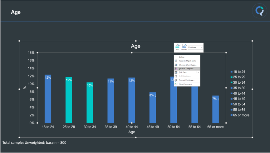
Because we selected To PowerPoint as Excel Chart in step 3, the data for each chart can be accessed by right clicking and selecting > Edit data
|
Tip: Some chart options (Create > Charts) in Q are not available in PowerPoint. If you would like to export one of these charts, select your chart and then can simply hit the Export to PowerPoint button again and choose “To PowerPoint as Image of Chart” in your options. |
Using the PowerPoint Chart Template Feature
Let’s say you want all your charts to appear in brand or company colors. We can save some time by using the PowerPoint Chart template feature.
- Got to PowerPoint and edit the look of your chart until you are happy with it.
- Right-click on your chart and select Save as Template. Name your chart template.

Now when you are back in Q and you want to export a table – click the export to PowerPoint button as normal and select your named chart template from the drop-down for Chart (you might need to scroll to the top of the list). Your chart will appear in PowerPoint in the same styling as the template you’ve set up.
Customizing Your Footer
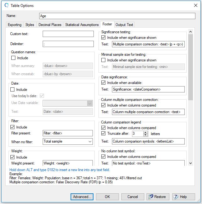
By default, Q includes a footer on all PowerPoint slides that shows Population size, filters, weight and significance level. You can override these in the same Export to PowerPoint box, under the Footer tab.

|
Tip: Some chart options (Create > Charts) in Q are not available in PowerPoint. If you would like to export one of these charts, select your chart and then can simply hit the Export to PowerPoint button again and choose “To PowerPoint as Image of Chart” in your options. |
Showing filters and dates in headings
Filters and dates can be automatically shown in headings that are exported to other programs, see Automatically Including Weights, Filters and Dates in Headings.
Automatic updating
Any Q project can be automatically updated with new data. This can be done by selecting File > Data Sets > Update and then selecting your updated data set. This can be useful when you want to build your report while the study is currently in the field, and then automatically update it with revised/final data later, see How to Update Projects with New or Revised Data for more detail. Once your project has been updated, you can also update previously exported Excel and PowerPoint files, see How to Export to PowerPoint.