Want to save a heap of time narrowing down thousands of crosstabs to just the ones you need? This post describes the approaches of deleting tables that aren't significant, creating heatmaps to summarize heaps of crosstabs, and using smart tables that conduct tests of statistical significance for the dependent question compared with each independent question.
What makes a table interesting?
Two crosstabs are shown below. Which of these is interesting? If we are going to automate the process of sifting through crosstabs we need to decide what makes a table interesting. The simplest way to do this is to see if there are meaningful differences between the percentages, reading across the rows. But instead of manually having to read them all, you can automate the process using tests of statistical significance. In our example below, I’ve used arrows and font colors to denote significant results. This can also be accomplished in different ways like having letters indicate which columns are different from others. Looking at these tables, only one of them jumps out as “interesting” and I bet you picked it right away.
Approach 1: Automatically delete tables that have no significant results
This approach is for those who love deleting things (and efficiency!). All you have to do is have your software automatically scan through all your tables and delete any that do not contain significant results – leaving you with only the statistically significant ones. I’ve got 3,050 crosstabs. By deleting three-quarters of these, I’m saving myself heaps of time and energy. While this is a great way to quickly narrow down your results, you’ll need to be proficient at writing code to script this in R and SPSS. If the thought of writing code makes you wince, use Q or Displayr. They both automate this – meaning it’s a click away.
The first step is to create lots of crosstabs. We do this by running the "lots of crosstabs" script. You can find the steps to run this script at How to Create Lots of Crosstabs. While running this script, you can indicate whether you would like to show all tables or delete tables that do not meet a specified significance level based on the p-values.
For this example, I am using the phone.sav data set, and I've selected all variables for the Rows, and various five-point agreement scales: Allows to keep in touch, Technology fascinating, …, Would like to do mobile banking with phone for the Columns.
You will now have many tables, each crosstabbing all the variable sets in your project by the key variable sets that you selected. If you are using the phone.sav data set that I am using, you will have almost 2,000 crosstabs!
To see the p-values or z-statistics on any of the tables, right-click on them and select Statistics – Cells > p and/or z-statistic. To add multiple statistics at the same time, hold down the Ctrl key on your keyboard.
If you didn't already delete all the tables that are not significant while running the "lots of crosstabs" script, you can do this in Q by:
- Select the folder(s) containing tables.
- Go to Automate > Browse Online Library > Delete tables and plots and choose one of the options. The smaller the p-value, the fewer tables that will be left.
Approach 2: Use a heatmap to summarize thousands of crosstabs
While the first approach wins points for effectiveness and ease, it loses points for being binary. In this approach, tables are either black or white, significant or insignificant. There’s no allowance for shades of grey. Luckily, we can enter a technicolor world with an even more powerful approach. Introducing using heatmaps to summarize thousands of crosstabs!
You can run one of Q's built-in functions to first identify interesting tables and then automatically create a heatmap to summarize the results. Please see How to Identify Interesting Tables for instructions.
The heatmap below summarizes 3,050 crosstabs. Each colored box shows the degree of statistical significance, where the degree is something called a z-Statistic. The darker the box is shaded, the more the underlying table is significant. Darker blue indicated higher z-scores, and the z-scores are capped at 5 (i.e., any value greater than 5 is changed to 5, as beyond 5 the differences are immaterial).
What can we glean from this? For example:
- The first column shows how other questions in the study were related to agreeing with Allows to keep in touch. Reading down this column we can quickly see that agreement with this attitude can be predicted by Work status, Occupation, and Age. Reading across the rows we can see that there is no other attitude that is related to these three.
- If we scroll down further you will see a white diagonal line of boxes. This shows the crosstabs of each attitude with each other. Putting aside the white, note how there are a lot more dark cells here. This tells us that the attitudes are highly correlated with each other. Also, note however that there is a lot of variation. Some of the cells are much darker than others, telling us that we can likely group together similar attitudes (e.g., using PCA or cluster analysis).
- Scrolling even further down, you will see that the blue gets very, very, pale for most, but not all, of the variables relating to behavior. We can see two things here. First, the attitudes and behavior in these examples are not closely related. Second, there are a small number of stronger relationships meriting more exploration (i.e., the very dark cells).
Why does the heatmap use z-Statistics?
There are a few issues with the traditional approach of deleting tables that exceed the p-value cutoff for significance (0.05). One of the main issues is that, as they get smaller and closer to 0, it becomes difficult to compare them without having to squint at a lot of decimal places. In the table below, you can see the p-values in the third row of numbers. If you zoom in on the Strongly disagree column, the p-values could be a whole range of numbers like 0.003, or 0.000000001 – it’s simply impossible to tell.
But wait, there’s a solution! The z-Statistics contain the same information as the p-value, except re-scaled to make comparison easier. Check the table below for a handy guide to converting p-Value to z-Statistic. The key value here is that the difference between p-values of 0.0001 and 0.0000001 is much bigger when viewed as a z-Statistic making it much easier to understand the practical differences between the two.
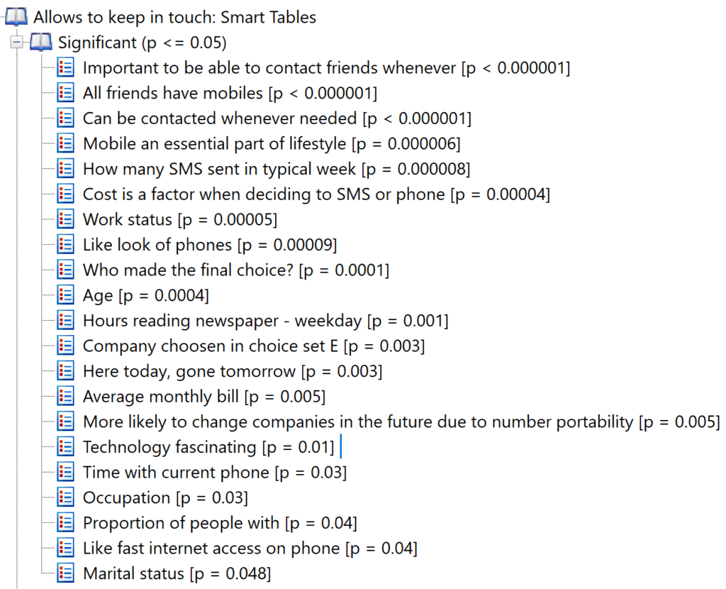
Approach 3: Smart Tables
The third approach kind of combines the two approaches from above for the best of both. This bit of magic works as follows:
- First, you identify a specific question of interest as the Dependent question. For example, if you want to profile a segmentation, then you select the variable that indicates which person is in which segment.
- Select any questions that may be of interest (Independent questions) as crosstabs with the question of interest. If you aren’t sure, you just select all the variables.
- Compute statistical significance for each of the crosstabs.
- Delete all the tables that aren’t statistically significant.
- Rank the tables according to statistical significance.
An example of such an output, from Q, is shown below. Like with the heatmap, we end up with an output that allows us to quickly identify the crosstabs of interest.
Smart tables are created using the steps found in How to Use Smart Tables.
Next
How to Apply Significance Testing in Q
How to Identify Interesting Tables