Introduction
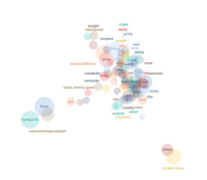
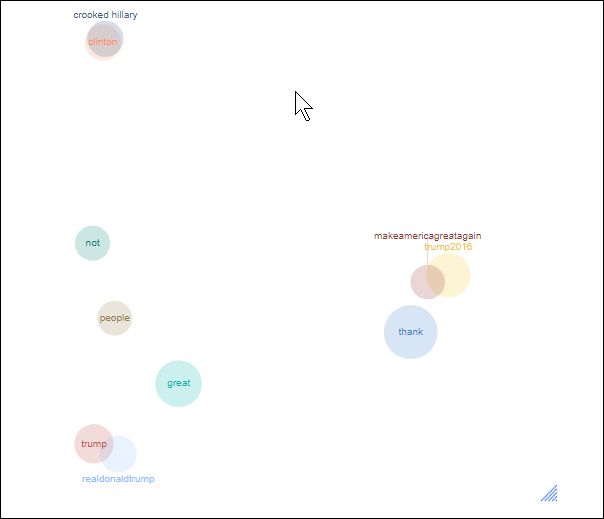
This article describes how to create a 2-dimensional map visualizing the tokens in a Text Analysis output based on their frequency patterns. The area of the markers is proportional to the number of respondents who used the token, whereas the position is determined by the selected dimension-reduction method (e.g., t-SNE, PCA, MDS).

Requirements
A Q project containing a setup text analysis object.

Method
- Go to Create > Text Analysis > Advanced > Map.
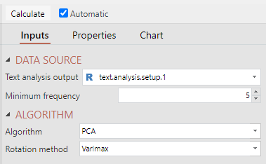
- Under Inputs > DATA SOURCE > Text analysis output select a Setup Text Analysis object.

- Ensure the Automatic box is checked, or click Calculate.
The output generated by this function will provide a bubble plot, like this:

OPTIONAL: The following settings can be adjusted to modify the map output:
From Inputs:
- Minimum frequency - Threshold number of times a token must occur before being included in the analysis.
- Algorithm - The dimension reduction method used to group and position the tokens. Details about parameters controlling the algorithm can be found in t-SNE, PCA, and MDS.
From Chart:
- Label font family - Font family of labels in the scatterplot.
- Label font size - Font size of labels in the scatterplot.
- Maximum number of labels - Specify the number of points showing labels. To avoid too many labels making the chart unreadable, the rest of the labels can be seen by hovering over the points.
- Marker opacity - Opacity of the markers ranging from 0 (transparent) to 1 (opaque).
- Maximum marker diameter - This controls how the size of the markers will be scaled.
Next
How to Do a Principal Components Analysis in Q
How to Automatically Categorize Unstructured Text Data
How to Show Sentiment in Word Clouds using Q