Introduction
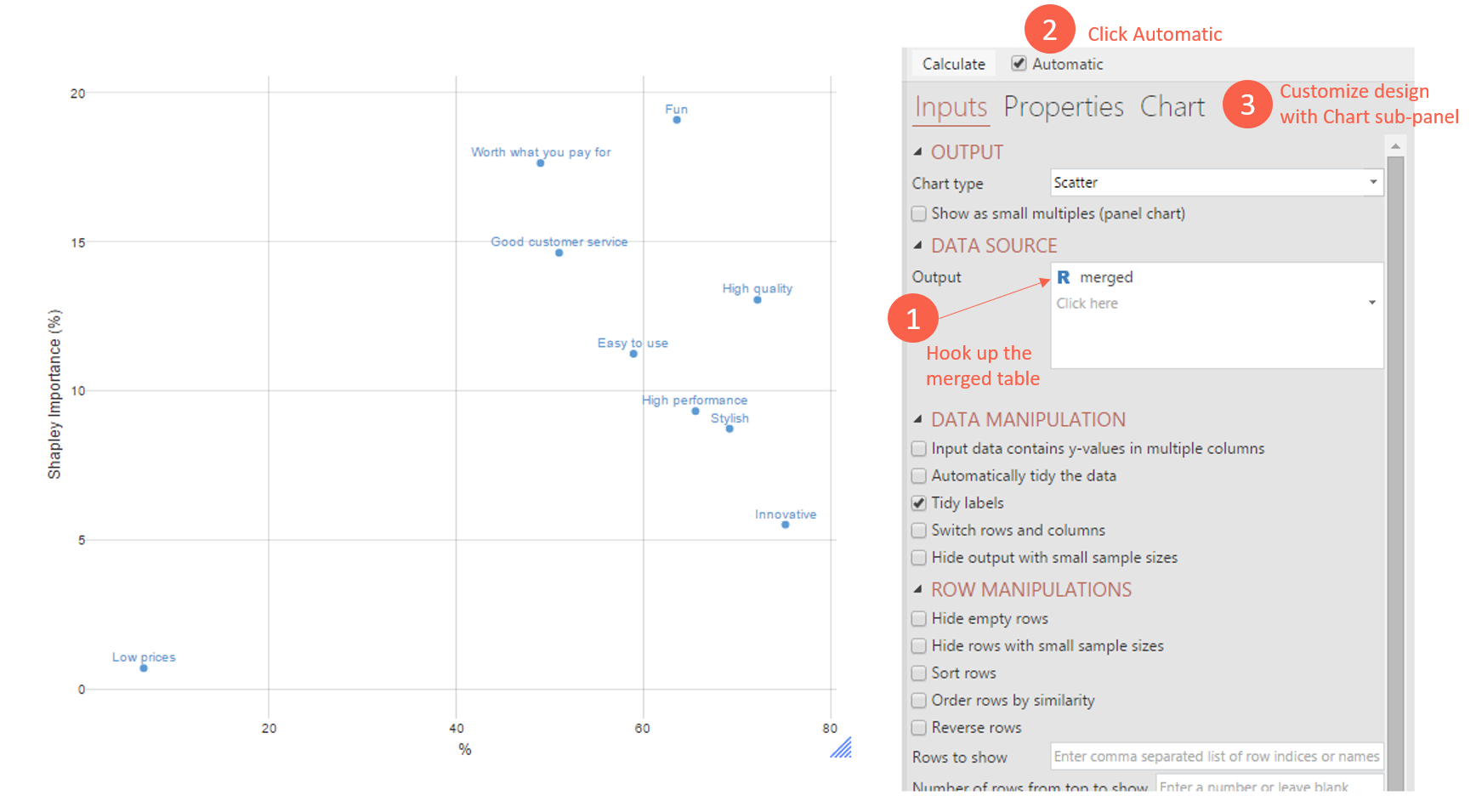
Popular amongst researchers is the importance vs. performance scatterplot. This is where you have a series of items that you place in a grid, where one of the axes is performance and the other is importance.
A bit like the scatterplot below:

Requirements
A data set containing variables you want to use as inputs in the driver analysis. Often driver analysis is performed using data for multiple brands at the same time. Traditionally this is addressed by creating a new data file that stacks the data from each brand on top of each other (see What is Data Stacking?). However, when performing driver analysis in Displayr, the data can be automatically stacked.
Method
Step 1: Make your source tables
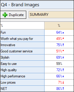
The first table is a summary table of associations of brands with personality attributes. Because this is stacked data, I’ve filtered the table by brand=Apple to produce Apple-specific ‘performance’ ratings:

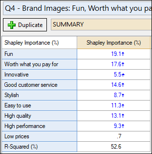
The second is a summary of a Driver Analysis (Shapley). I’ve removed the statistics for the table so it just has the Shapley Importance scores. We have the option to have results for all the brands (general model) or to filter by Apple. In this case, I’ve decided to filter by Apple as well so that the importance scores are Apple-specific.

In the next step, we’re literally going to “glue” the scores side-by-side.
Step 2: Merge the tables
- From the menu ribbon, select Create > Tables > Merge Two Tables
- Over on the right-hand side (the Object Inspector) specify the two tables above to be your input tables.
- Specify that the join direction is side-by-side
- Push Automatic (next to Calculate) – so that this table always stays up to date automatically if any changes are made to your source tables (an R output always needs to be calculated or recalculated)

The table above is literally matching the items, meaning that it includes both the R-Squared row and the NET row from the original table. As we don’t actually want this for the purpose of the impending scatterplot, you can remove it by changing “Keep all” to Non-matching rows/columns: Matching Only.
Step 3: Create the visualization
From the menu ribbon again, select Create > Charts > Visualization > Scatterplot
Now in the Object Inspector for this output, specify the DATA SOURCE to be an Output. That Output is the merged table we just made (by default called ‘merged’ here). Again push Automatic to keep it up-to-date automatically.

Then, to get it looking just like I have in the above image, you can customize the design options under the Chart tab of the Object Inspector. For example, I set APPEARANCE > Show Label: On Chart – so that the labels appear on the chart. There are lots of options to customize here with respect to design.
NEXT
How to Show Clusters in a Scatterplot
How to Do Traditional Correspondence Analysis
How to Use Partial Least Squares to Conduct Relative Importance Analysis