Introduction
This article describes how to create a CreateCustomTable R table with multiple statistics so that you can take advantage of all the customizations in the CreateCustomTable function.
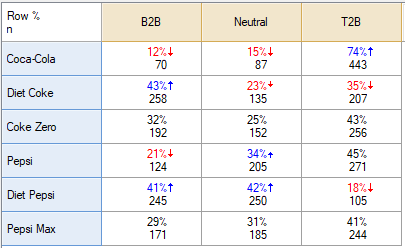
This article explains how to go from a table with multiple statistics like this:

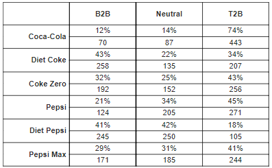
To a table that enables you to add in more font, color, and formatting customizations (examples under See Also below):

Requirements
- A table showing multiple statistics, or a combined table created with R (see: How to Combine Tables with Multiple Statistics Using R).
- The code below is on the more complex side so a familiarity with How to Work with Data in R, How to Perform Mathematical Calculations Using R, and How to Work with Conditional R Formulas is very useful.
Method
The example below reformats a multiple statistic table in R for the CreateCustomTable function. The code then automatically creates a list of spans to span both the Row % and n rows of each brand. To modify for your own document, please read through the comments (denoted with #) and edit where appropriate.
You can see other options for further customizing the final table at CreateCustomTable.
- Right click in the Report tree and select Add R Output.
- Paste in the following r code in the R CODE box on the right:
###Identify table to use
mytable = table.Brand.attitude.5

###Convert the table (which is an array because there are multiple stats)
###to a 2 dimensional table
#load the reshape2 functions needed
library(reshape2)
#use melt() to make the table "long" with a row for each stat/row name pair
mytable=melt(mytable)
#use dcast() to make the table "wide" keeping two columns for brand (Var1) and statistic (Var3) and creating columns for each rating categories
mytable=dcast(mytable, Var1 + Var3 ~ Var2)

###Add in custom formatting for row% and counts
#round the data (in columns 3-5) to whole numbers
mytable[3:5]=apply(mytable[,3:5],2,round,0)
#add % to the row % rows (in columns 3-5)
mytable[mytable$Var3 == "Row %",3:5]=apply(mytable[mytable$Var3 == "Row %",3:5],2,paste0,"%")

###automatically create list of spans and format for final table
###(each brand span will span over the Row % and Count rows)
#create the list of lists automatically that create spans for final table using Var1
spans=lapply(unique(mytable$Var1),function(x) list(height=NROW(mytable)/length(unique(mytable$Var1)), label=x))
#create placeholder rownames which will be hidden later
rownames(mytable)=paste(mytable$Var1, mytable$Var3)

###Create the custom table
#row.header.labels are overridden as blank because we want to use spans to label
#col.widths sets the second column (the blank row labels) to 0 to hide it
flipFormat::CreateCustomTable(mytable[,!colnames(mytable) %in% c("Var1","Var3")],
         row.header.labels=rep(" ",NROW(mytable)),
         col.widths=c("25%","0%","25%","25%","25%"),
         row.span.align.horizontal="right",
         row.spans=spans,
         row.span.pad=5,
         border.width=1,
         border.color="black")
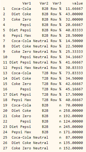
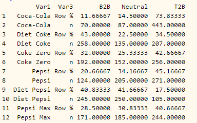
Given the data manipulation above, it can be helpful to see a preview of what the table looks like after melting and dcasting.
After melting:

After dcasting using the formula Var1 + Var3 ~ Var2:

3. Right click on the R Output and select Calculation Options.
4. Change Exporting > Format > To PowerPoint as Image of R Output. Note that this means you cannot edit the table once it is exported to PowerPoint.
Next
How to Customize a Table using CreateCustomTable in R
How to Customize Fonts in a CreateCustomTable R Table
How to Add Row Spans to a CreateCustomTable R Table
How to Add Column Spans to a CreateCustomTable R Table
How to Add Statistical Significance to CreateCustomTable R Tables
How to Use Paste Functions to Create Automatic Text Using R