Customizing the formatting of built-in standard tables in Q is somewhat limited and you are limited to the table styles available in Office. Sometimes you may need to create very custom formatting changes to a table, this can be done with an Autofit table (use Create > Tables > Enter Data and check Autofit). However, you have even more flexibility in formatting with creating the table in R using the CreateCustomTable function from our flipFormat package.
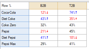
In our example we will go from a table with two columns differences...

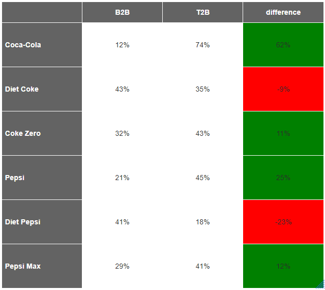
...to a CreateCustomTable R table (similar to a table with Autofit checked) with specific colors and a difference column colored by values:

Requirement
- A table or you can create your own table/data inside the R Output. We will use the table above in our code below.
- Knowledge of customizations available in CreateCustomTable.
Method
1. Right click on the Report tree and select Add R Output.
2. Paste the below under Properties > R CODE and modify it to your liking:
####Setup the data
#specify the table you'd like to use
mytable = table.Brand.attitude.duplicate
#change it to a data.frame to make it easier to work with
mytable=data.frame(mytable)
#create difference column
mytable$difference=mytable[,2]-mytable[,1]
#divide by 100 to get in percentage format
mytable=mytable/100

####Create the formatting
#make matrix of cell.colors the same shape as your table default the color to white
cell.colors=matrix("white",nrow=NROW(mytable),ncol=NCOL(mytable))
#specify the column(s) that you'd like to shade
shade=NCOL(tab)
#shade the cells green above 0%
cell.colors[,shade]=ifelse(tab[,shade] > 0,"green",cell.colors[,shade])
#shade cells red below 0%
cell.colors[,shade]=ifelse(tab[,shade] < 0,"red",cell.colors[,shade])

####Create the table
#create custom table using CreateCustomTable
flipFormat::CreateCustomTable(mytable,
        format.type="Percentage",
        row.header.fill = "#636363",
        row.header.font.color = "white",
        row.header.pad = 5,
        col.header.fill = "#636363",
        col.header.font.color = "white",
        corner.fill = "#636363",
        corner.font.color = "white",
        cell.fill=cell.colors) #pass your table of colors from above to cell.fill
3. Right click on the R Output and select Calculation Options.
4. Change Exporting > Format > To PowerPoint as Image of R Output. Note that this means you cannot edit the table once it is exported to PowerPoint.
Note, you can reference colors by HTML name, HEX, and rgb, e.g. rgb(255,255,255).
See Also
How to Customize Fonts in a CreateCustomTable R Table
How to Add Row Spans to a CreateCustomTable R Table
How to Add Column Spans to a CreateCustomTable R Table
How to Customize a Table with Multiple Statistics using CreateCustomTable in R
How to Add Statistical Significance to CreateCustomTable R Tables