Introduction
This article describes how to go from two tables...


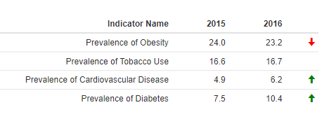
...to an R table using the formattable package to add colored significance arrows based on the values in the second table.

Requirements
- A table with multiple rows and a time period range in columns.
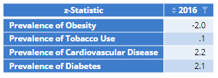
- A table showing z-Statistic for the desired time period. In this example, we are using the z scores from the 2016 data.
Method
1. Select your tables.
2. Copy the names from Properties > GENERAL > Name.
3. Right click in the Report and select Add R Output.
4. In the object inspector go to Properties > R CODE.
5. Reference the formattable R library and reference the tables using the names from step 2. In this example, we are first adding the row labels from the prevalence.table as a new column called 'Indicator Name' before removing the table row headers. Finally, we are also appending the z scores from the prevalence.z.scores table to our table, keeping only the columns we need:
library(formattable)
prevalence <- cbind("Indicator Name" = rownames(prevalence.table), as.data.frame(prevalence.table))
z = prevalence.z.scores
prev.sig = cbind(prevalence,z=z[,NCOL(z)])
rownames(prev.sig) <- c()
prev.sig = prev.sig[, c(1,6:7,10)]
6. Next, we set the final column to store the significance arrows and set column z to false so it doesn't display. Here, we format the new column with green 'up' and red 'down' arrows based on the size of the z score using the style and icontent arguments. This argument uses the 1.96 threshold for significance testing at 95%.
names(prev.sig)[4] = " "
formattable(prev.sig,
list( z = FALSE,
" " = formatter("span",
style = ~ style(color = ifelse(`2016` >`2015`, "green", "red")),
~ icontext(sapply(` `, function(x) if (x < -1.96) "arrow-down" else if (x > 1.96) "arrow-up" else "")))))
Next
How to Add Sparklines to a Table Using the Formattable R Package