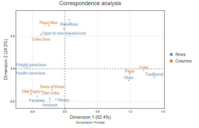
This article describes how to go from a standard correspondence analysis map:

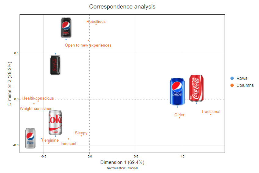
To a map with images representing the brands:

Requirements
- A Q project containing a traditional correspondence analysis
Method
- Create logos of similar sizes, and put them somewhere on the web. The most straightforward way to do this is to use Dropbox and share the files. Make sure that you check this has worked by pasting the URLs into your browser; if you do not see the logo, something has gone wrong.
- In Q, select your Correspondence Analysis output.
- From the object inspector, tick Inputs > Use logos for rows. If you want to instead use logos for the data in the columns, tick Switch rows and columns.
- Paste your URLs, with commas between them, into the Logos box and press Calculate. The order of the images in the list should match the order of the rows in the table. The list of URLs that I used in the example above looks like this:
https://docs.displayr.com/images/9/90/Coke.png,
https://docs.displayr.com/images/0/09/DietCoke.png,
https://docs.displayr.com/images/c/c1/CokeZero.jpg,
https://docs.displayr.com/images/5/5e/Pepsi.jpg,
https://docs.displayr.com/images/b/b0/DietPepsi.jpg,
https://docs.displayr.com/images/0/08/PepsiMax.jpg
The resulting visualization, shown above, is interactive. You can manually move the logos and the labels around.
Next
How to Do Traditional Correspondence Analysis