This article describes how to interpret Trees output.
Tree outputs are created by Latent Class Analysis, Mixed-Mode Cluster Analysis, and Mixed-Mode Tree.
Requirements
Tree output created by
- Latent Class Analysis
- Mixed-Mode Cluster Analysis
- Mixed-Mode Tree analysis
Method
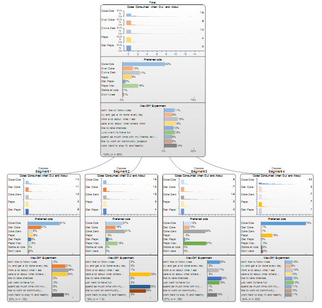
The first node of the tree (i.e., the box at the top) provides summary information for the entire sample. The nodes underneath show the results for the segments. In this example there are four segments.
The example below shows the default appearance of the segments when conducting Form segments by in Segments is set to splitting by individuals (latent class analysis, cluster analysis, mixture models (see Trees for further information interpretation with the split by questions (tree)).
That there are four segments indicates that either the user manually specified they wanted four segments, or, four segments has been recommended by the program by application of an information criteria (see Segments).
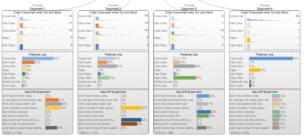
The first block of outputs shown in each of the segments shows histograms, revealing the distribution of the data. We can see that in each case, most of the respondents have values of 0 (note that we can see the scale on the node shown at the top). Histograms are always shown for numeric data and only for histograms (i.e., a histogram is used for each of Number, Number - Multi and Number - Grid).
The averages are shown to the right of each histogram, and thus we can see that in Segment 1 the average consumption of Coca-Cola is 1.4, while it is 1.8 in Segment 2, 0.6 in Segment 3 and 3.0 in segment 4. The shading of the histograms is also designed to emphasize the relative differences. Thus, the darkest shading is for 3.0 (segment 4), whereas the lightest shading is for the lowest value of 0.6 (segment 3). The shading does not connote either statistical significance nor managerial importance: it is as simple as that the highest value is dark, the lowest value is lighter and the in-between values are proportional.
The next block of outputs is for a Pick One question. The percentages indicate the estimated proportions within that segment. Thus, while for the total sample 9% prefer Pepsi (this is shown in the hard-to-read box at the top), the score in Segment 1 is 9%, segment 2 is 3%, etc. The shading indicates relativities, in the same way as with the histograms.
The third block of results shows estimated Probability % from a MaxDiff experiment, with a Question Type of Ranking. From an output perspective this is indistinguishable from the output from categorical data, however, in practice this is not a source of confusion as users have to always explicitly tell Q to treat the data as Rankings.
The estimated size of each segment as a percentage and in terms of number of respondents is shown at the bottom of each segment. Thus, Segment 1 contains 122 people and represents 20% of the population. It is commonplace that when crosstabs are created using the segmentation variable that the segment sizes will differ from the numbers shown in these boxes (although the differences are typically small). This is because the segment sizes that are shown on the tree are estimates, where the estimates are constructed under the assumption that there is uncertainty (e.g., a person may have a 33% chance of being in one segment and a 66% chance of being in another and a 1% chance of being in a third). By contrast, when the segments variable is selected in crosstabs the assumption is that each person must be in one and only one segment, and the difference between these assumptions causes differences in results. When a weight is used, the total population size (as shown in the Population in the top node) is the Effective Base n for the sample that has been used for the segmentation.
Next
How to Do a Mixed-Mode Tree Analysis

