Introduction
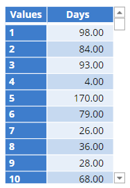
This post will take you from a variable that shows a numeric variable, such as the number of days to purchase a product:
To a state where the data is visualized as a Density plot, showing the peak in the data, in this case, the number of days until purchase: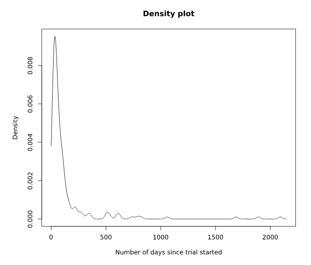
Requirements
You will need a variable with the Question Type Number on the Variables and Questions tab.
Method
- Right click in the Report tree and select Add R Output.
- In the object inspector, go to Properties > R CODE and paste in the following code and click Calculate.
plot(density(Days, from = 0),
main = "Density plot",
xlab = "Number of days since trial started")
Replace Days in the code above with the name of the numeric variable you wish to use to create the density plot. The second and third lines of the code add the output title (e.g., Density plot), and the x-axis title (e.g. Number of days since trial started).
OPTIONAL:
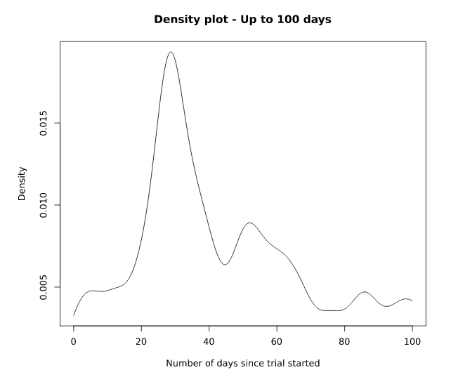
You can modify the R code slightly to remove outliers from your density plot output or reduce the date range to make it easier to determine where the peak occurs. In the example below, data is plotted only for the first 100 days (to = 100) and the bandwidth has been changed to estimate the density (adjust = 0.2).
plot(density(Days, from = 0, to = 100, adjust = 0.2),
main = "Density plot - Up to 100 days (86% of data)",
xlab = "Number of days since trial started")
Next
How to Make a Snake Plot in Q and Export it to PowerPoint
How to Customize the Standard R in R-based Outputs