Introduction
This article describes how to go from a crosstab of data containing a Date/Time variable, and a Numeric variable...
...to a state where the data can be visualized as a time series graph allowing viewers to explore sequences of data ordered by time. The time series can be explored by zooming in or out and using a range of scales.
Requirements
- A Date/Time structure variable.
- At least one Numeric structure variable.
- A table with Date/Time values in the first column (if using a table as a Data Source).
Method
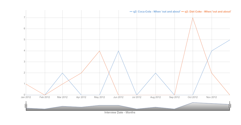
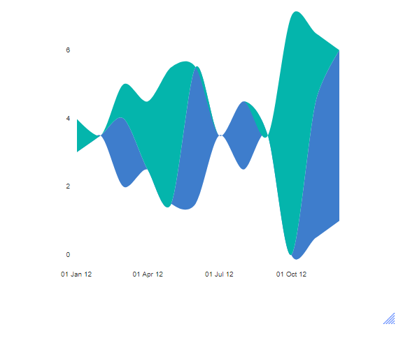
- Select Create > Charts > Visualization > Time Series > Time Series with Dynamic Window. This will produce a chart like the one above. To create a stream style chart, select Create > Charts > Visualization > Time Series > Stream. A stream graph is a variation of a stacked area chart that displays changes in data over time of different categories through the use of flowing, organic shapes that create an aesthetic river/stream appearance.
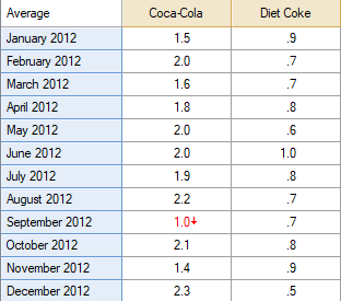
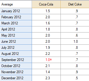
- Outputs. Any of the tables in the rest of your Q project with dates or times as the row names can be used here. In the example above we used monthly data during 2021 for Coca- Cola and Diet Cokes.
- Variables. We can also plot variables directly from the dataset. The variables will be treated as though they were columns of the input table. Put the date variable first, and then one or more numeric variables following it. If you see a warning about duplicated entries in the date variable, then you need to check the aggregation period (e.g., monthly instead of weekly data) of the date variable. To adjust the aggregation, click on the variable in the Data tree then in the object inspector on the right, click on the Date/Time button under Structure.
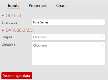
- Paste or type data. If you don’t plan to use the data for other analysis, the most direct approach is to type it into the chart object. Click the red button labeled ‘Paste or type data’ and a spreadsheet will pop up into which you can enter your data. In the same way as the other input options, the left-most column should contain date information. For most standard formats, Q is able to automatically convert text to dates.
Options

Additional options to customize the time series graph can be found in the Chart tab of the object inspector. Specifically, the options for time series graph are:
- Show range bars. In the time series graph above, you can see a shaded region surrounding the red line. The chart automatically determines which columns to use for the lower and upper bounds by checking the mean value of each column. Note that this option requires input data to contain exactly three columns and cannot be used with multiple series.
- Window start controls the initial state of the range selector at the bottom of the chart. Viewers can scroll on the range selector to change the date range, but the window start determines their first view of the chart.
Related charts
Other chart types in Q can also handle time series data. In particular, Line or Column charts have additional options for adding smoothed trend lines or customizing data labels. You can easily switch between chart types using the Chart type dropdown (in the Inputs tab of the Object inspector ).
Next
How to Do Time Series Analysis in Q