This article describes how to go from a table or crosstab like this:

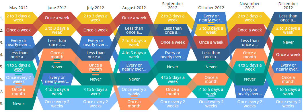
To a Ranking (Bump) chart like the below, which shows the relative order of data values:

Requirements
- A table containing at least two rows and two columns.
Note: R outputs/items cannot be used as inputs for Q's built-in ranking/bump charts.
Method 1 - from an existing table
- From your table, go to Show Data as and click the arrow next to Table:

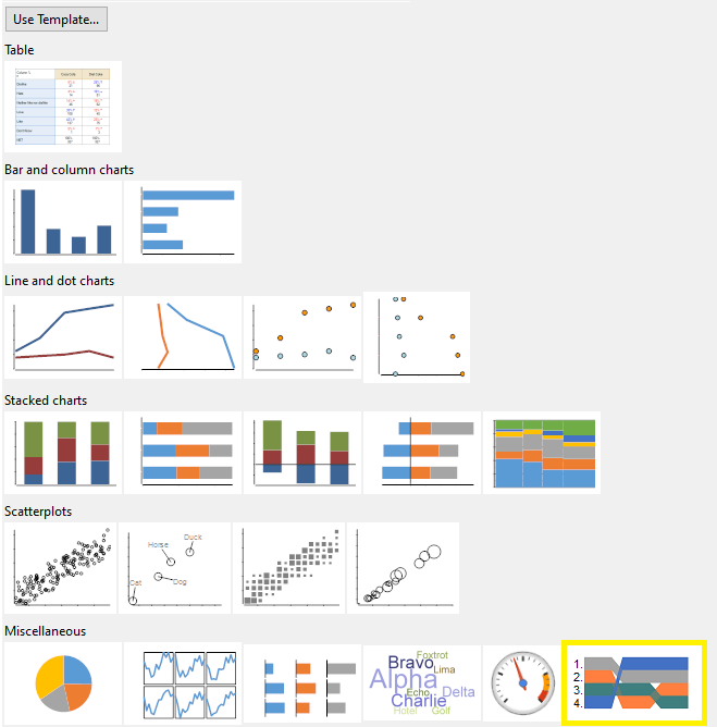
- Navigate to the Miscellaneous group and select Ranking Plot:

Method 2 - from the Chart menu
- From the toolbar, go to Create > Charts > Chart and from the Miscellaneous group select Ranking Plot:

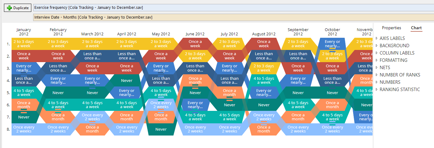
- From the Blue dropdown menu, select the variable to represent the rows of the visualization.
- From the Brown dropdown menu, select the variable to represent the columns of the visualization.

Next
How to Create a Palm Tree Chart