This article describes how to go from a set of variables or data table to a state where the data is visualized as a Sankey diagram.
Requirements
You will need any of the following:
- At least two variables of any type,
- An input table using at least two variables, or
- Values typed or copied into a table manually with at least two columns.
Method
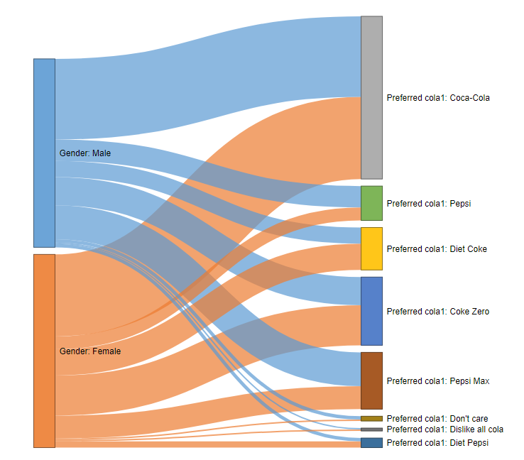
- Go to Create > Charts > Visualization > Exotic > Sankey.
- In the object inspector, go to Inputs > DATA SOURCE, select the type of data source you wish to use to create the Sankey diagram.
- If you wish to use an existing table go to Input table and select the desired table from the drop-down menu.
- If you wish to use variables go to Variables and select the desired variables from the drop-down menu.
- To input the data manually, select Paste or type table. A new dialog box window will open where you can paste or type in your data. Note that the table must have at least two columns.
- Click Calculate.
- OPTIONAL: Specify the maximum number of categories to display for each variable by entering a number in Maximum number of categories.
OPTIONAL: You can customize the look of the diagram by going to the object inspector > Chart and adjusting the settings for APPEARANCE, LABELS, and HOVERTEXT.
Settings for APPEARANCE > Links colored by are as follows:
- None: all links are shown in grey.
- Source: links are shown in the same color as the source node (left).
- Target: links are shown in the same color as the target node (right).
- First variable: similar to Source, but nodes will also be the same color as nodes they are linked to on the left. If there are multiple such nodes, then the color will be taken from the node which is linked with the largest weight.
- Last variable: similar to First variable, but using the color of the Target node, and looking at downstream links.
NOTE: An error will occur if more than 20 variables are selected. It is generally advisable to show a relatively small number (e.g., 4 or 5).