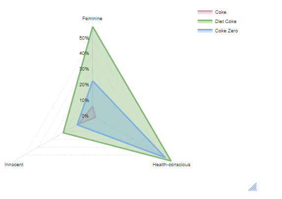
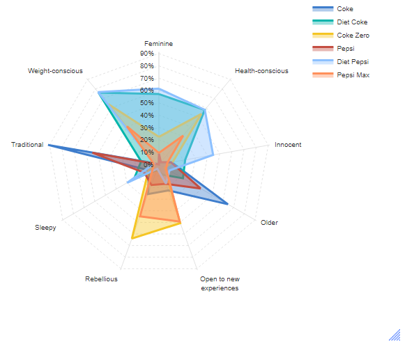
This article describes how to turn a table or crosstab like this:

into a radar chart like this:
Requirements
- You need a table or crosstab with a minimum of three rows (the spokes on the chart) and at least one column (the different series that will be layered)
Method
- From the menu, select Create > Charts > Visualization > Radar > Radar.
This will bring up the Object Inspector. - In the Object Inspector, from Inputs > DATA SOURCE > Output, select the table you want to visualize.
-
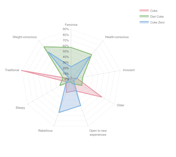
OPTIONAL: Under Inputs > COLUMN MANIPULATIONS > Number of columns from left to show enter the number 3. This will take only the three leftmost columns from the table as in the example above.
-
OPTIONAL: Under Chart > DATA SERIES change Color palette to Rainbow.
Next