Introduction
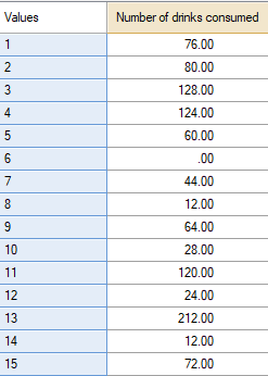
This article describes how to go from numeric data:
To a state where you can visualize the distribution of this numeric data:
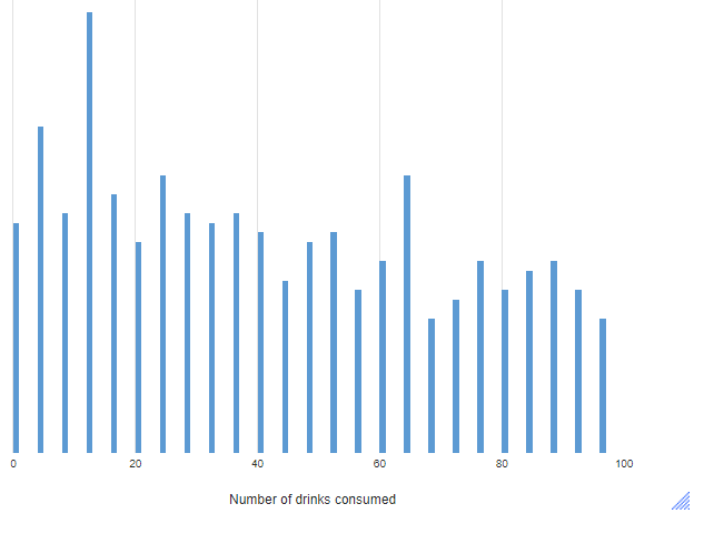
Requirements
A numeric variable (as shown with a "2" next to the name in the Data Sets tree):

OR numeric data that you wish to paste directly into the visualization.
Method
- From the toolbar, select Create > Charts > Visualization > Distributions > Histogram.
- Click into Inputs > DATA SOURCE > Variables and choose the numeric variable or variables that you want to include in the histogram. Alternatively, you can click on the Paste or type data button under Inputs > DATA SOURCE to enter numeric data or select Inputs > DATA SOURCE > Output to select an existing output on one of your pages.
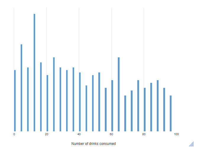
- OPTIONAL: You can set the minimum and maximum values shown on the X-axis by going to Chart > VALUES (X) AXIS > Minimum value/Maximum value. In this example, I set the maximum value to 100.
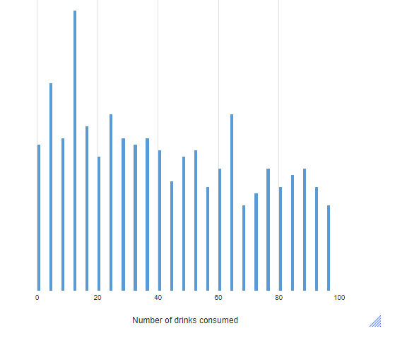
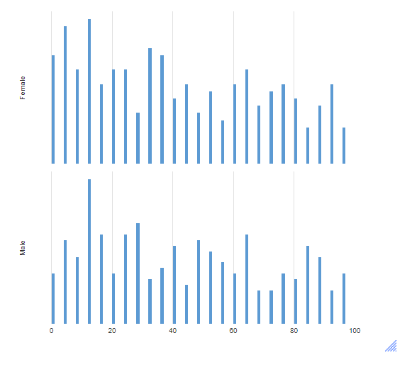
- OPTIONAL: You can add an additional variable containing categories when creating a histogram using existing variables. To do so, follow the instructions above in Step 2, and then select the variable you wish to split the histogram by under Inputs > DATA SOURCE > Groups. The result is a set of histograms, which share the same set of axes, allowing for easy comparison.
Next
How to Compute Percentiles in Q