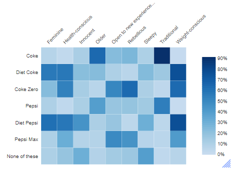
This article describes how to go from a table or crosstab of data, such as this:

To a heatmap, like this:

Further settings are discussed below that may make finding patterns in your data easier.
Requirements
You will need a table of data that consists of two or more rows and one or more columns.
Method
Simple Heatmap
To create a heatmap:
- Select Create > Charts > Visualization > Heatmap.
- Click Inputs > DATA SOURCE > Output in the Object Inspector on the right, and select your table from the list.
- Click Automatic. This ensures the chart will re-draw itself whenever the input data changes or you change any chart settings.
- Change formatting options in the Chart section of the options on the right.
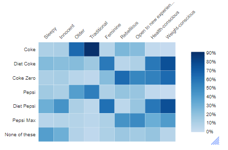
The initial visualization of the chart looks like this:
Sorted Heatmap
Follow the same process you used to create a simple heatmap, but add the step:
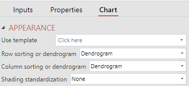
- In the Object Inspector, select Chart > APPEARANCE > Row sorting or dendrogram and/or under Chart > Appearance > Column sorting or dendrogram
- Select how you would like to sort the data in the table by selecting Sort by averages (ascending) or Sort by averages (descending).
This example has been sorted using Chart > Appearance > Column sorting or dendrogram > Sort by averages (ascending).

Heatmap with Dendrogram
Follow the same process as you used to create a simple heatmap, but add the step:
- In the Object Inspector, select Chart > APPEARANCE > Row sorting or dendrogram and/or under Chart > Appearance > Column sorting or dendrogram
- Select how you would like to sort the data in the table by selecting Dendrogram.

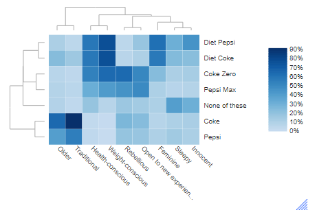
The example here has been created by selecting Dendrogram for both rows and columns. It groups together the attributes on the rows and columns by similarity.

Using Color Scales
Heatmaps are created by applying a range of colors to a table, with the different color gradients representing the range of values. Q automates this process with a selection of predefined color scales as well as the option to define your own gradients.To apply color scales to one of your tables:
- Select Automate > Color Scale.
- Choose the predefined scale you would like to apply to your data or select More Rules to set specific rules.
- In the New Formatting Rule window, make selections for the statistic you want to utilize in creating the color scale, the type of scale you want to create (2-color or 3-color), whether to include NETs/SUMs, and the colors to build your color scale from.
- In setting up a gradient from the New Formatting Rule window, there is the added feature to set static minimum, midpoint, and maximum values (2-Color Scale with Values or 3-Color Scale with Values). Otherwise, Q will automatically define these values based upon the range of values being evaluated.
In this first example, I’ve used one of Q’s predefined color scales on a crosstab of age and device ownership, with red signifying the smallest values, yellow representing the midpoint, and green signifying the highest values:
The addition of the colors allows for easy evaluation of low scores, like all of the “Less than 18″ responses”, and the highest, like many of those for Mac computers (desktop or laptop). Also note that this method allows for significance indicators to remain on the table.
Creating a heatmap with the Visualization menu
You can also create a heatmap using the Visualization menu. You’ll need to have a table ready – heatmaps require 2 dimensions of data.In this example, we will create a heatmap that plots household structure by age. For my data input, I’ve placed the a household structure question in the blue drop down and an age question in the brown drop-down.
To create a heatmap using this table as an input:
- Select Create > Charts > Visualization > Heatmap.
- Click Inputs > DATA SOURCE > Output in the Object Inspector on the right, and select your table from the list.
- Click Automatic. This ensures the chart will re-draw itself whenever the input data changes or you change any chart settings.
- Change formatting options in the Chart section of the options on the right.
The initial visualization of the chart appears like this:
This visualization clearly shows the most common data intersections with the heaviest blue color. In this case, we can see that older respondents (55 or above) were more likely to live only with a partner while respondents aged 30-54 were most likely to live with a partner and children. To see the underlying data for any section of the heatmap, hover your mouse over the section of interest and information about its contents will appear. Otherwise, you can add data labels to the heatmap using the Chart section of the Object Inspector.
Using the Chart section of the Object Inspector, you can make additional adjustments to the heatmap’s output. For instance, we can change the color scheme from a list of preset color schemes. The list includes options for schemes ranging from light to dark, dark to light, multiple colors, or even a custom palette.
The heatmap can be sorted automatically using the row and column options in Chart > APPEARANCE. Rows and columns can be sorted according to the average value in the row, or we can sort using dendrograms. A dendrogram is a tree diagram that outlines hierarchical clusters. This adds an additional layer of analysis to the heatmap while not detracting from its merits. In the image below, you can see that I’ve added dendrograms to both axes of data and as a result, Q has adjusted the ordering of data on each axis. I’ve also chosen a different color scheme, reds from light to dark.