Introduction
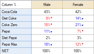
This article describes how to go from a table with at least two columns, like this:

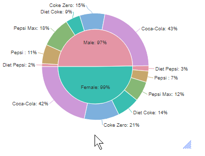
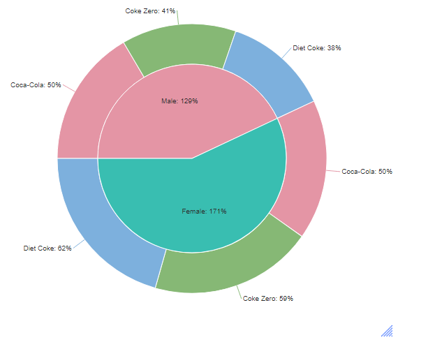
To a Grouped/Clustered Pie Chart, like this:

Requirements
A table or a crosstab consisting of at least two rows and two columns of data.
Method
- From the toolbar, go to Create > Charts > Visualization > Pies > Clustered Pie.
- Under Inputs > DATA SOURCE > Output select the table you wish to display with the chart.
- If, instead of a table, you wish to use variable(s), under Inputs > DATA SOURCE > Variables select the variables from the drop-down menu.
- OPTIONAL: Under Inputs > ROW MANIPULATIONS select Sort rows.
- OPTIONAL: Under Chart > DATA SERIES > Color palette select Rainbow.
- OPTIONAL: Under Chart > DATA SERIES > Color palette of outer ring select Rainbow.

Next
How to Create a Pie Chart in Q