Introduction
This article describes how to create a stacked column chart from an existing table like this:
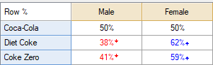
To a chart like this (a 100% stacked column chart):

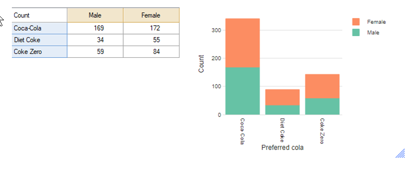
The same process can be used to create a column chart where the total does not add up to 100%. For example, the below chart was created using the same data as above, but replacing the percentages with the count for each cell:
Requirements
- A table with at least two columns and at least one row.
Method
- From the toolbar, select Create > Charts > Visualization > Column > Stacked Column.
- Under Inputs > DATA SOURCE > Output select the table that you want to base the chart on.
- OPTIONAL: Under Chart > DATA SERIES > Color palette change the palette to Colorblind safe colors.
- Click Calculate and/or ensure that Automatic is checked.
Next
How to Make a Column Chart in Q