Introduction
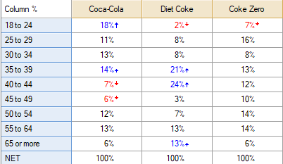
This article describes how to create several column charts using small multiples (panel charts), starting with an existing table like this:
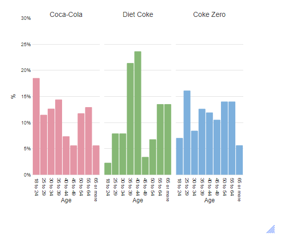
We will end up with several small column charts like this:
Method
1. From the toolbar select Charts > Visualization > Column > Small Multiples Column.
2. Under Inputs > DATA SOURCE > Output select the table that you want to base the chart on.
3. Under Chart > APPEARANCE change the value in Number of rows of panels to 1 (this will ensure the three charts end up next to each other. Setting this to 2 or higher would show the charts one above the other).
4. OPTIONAL: Under Chart > DATA SERIES > Color palette change the palette to Rainbow.
5. OPTIONAL: Change the Chart > VALUES (Y) AXIS > Maximum value to 0.3 to set the highest point on the Y-axis to 30%.
6. Click Calculate and/or ensure that Automatic is checked.
Next
How to Make a Column Chart in Q
How to Create a Stacked Column Chart in Q