Introduction
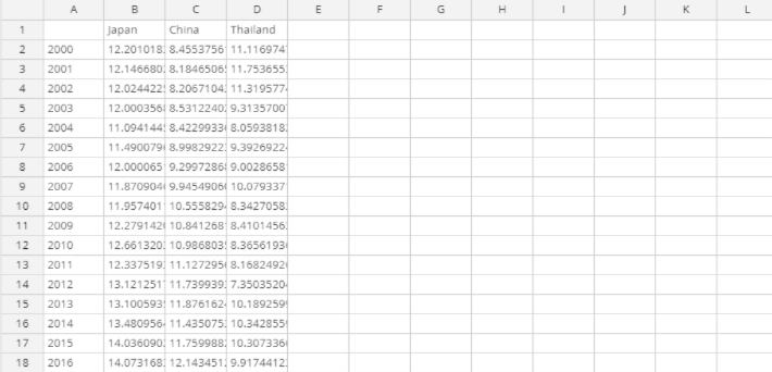
This article describes how to go from times series data such as this...

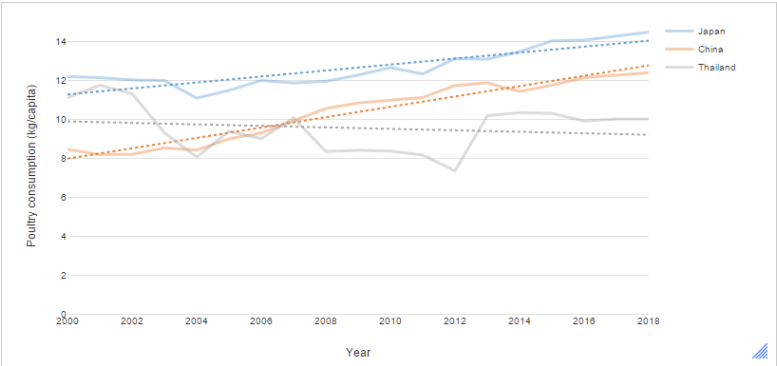
... to a time series chart with linear trend lines.

Requirements
A data set with one or more time series (date) variables. In this example, we are looking at changes in poultry consumption between years for Japan, China and Thailand.
Method
Adding a linear trend line
- From the toolbar, select Create > Charts > Visualizations > Line > Line.
We inserted the data by clicking the Paste or type data button and pasting in the following cells. Note that instead of using the Paste or type data button, we could have used a different data source with a similar structure — such as a Q or R table — and entered it into the drop down menu for Outputs. - On the Chart tab in the object inspector, look for the Trend lines group. Set the Line of best fit dropdown to Linear.
Trend lines using non-parametric smoothers
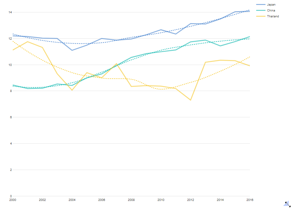
In many cases, we want to estimate a trend that is not constrained to a straight line. To estimate smooth trend lines, we can use cubic splines, Friedman’s super smoother, or LOESS (locally weighted scatterplot smoothing). For example, in the case of Thailand, we saw that a linear line does not describe the trend very well. if we change Line of Best fit to LOESS we see a downward trend following by an upward trend.

NEXT
How to Smooth a Time Series in Q
How to Set Time Periods for Date Questions
How to Show a Moving (Rolled) Average on a Line Chart Visualization
How to Create a Time Series Graph
How to Do Time Series Analysis in Q