Introduction
This article describes some approaches to smoothing time series in Q.
You can use Q to smooth time series data in two ways: by adding a trend line to a Visualization chart, or by using Time Series charts. In this article, we’ll show you how to use both of these methods to plot and smooth your own data in Q.
Requirements
A data set with one or more time series (date) variables.
Method
Setting up the date variable
Before beginning any analysis, it is important to ensure that the date variable is set up properly. To do so,
- Select the Variables and Questions tab
- Ensure that the Question Type is set to Date/Time.
For example, if you want to compute five-month moving averages, the aggregation unit should be in months.

Adding trend lines in Visualizations
- Select the variable of interest in Variables. If the variable is numeric, the mean will be shown on the y-axis; otherwise, counts will be used.
- Select the date variable in Groups. The aggregation will be determined by the aggregation unit selected here.
- Tick the checkbox to swap rows and columns.
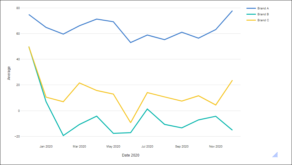
Now you are ready to add trend lines to the chart. - In the Object Inspector, use the Chart > Trend Lines > Line of best fit menu to add a trend line to the chart. Trend lines can be computed using four different methods: linear regression, LOESS, Friedman’s super smoother, or cubic splines. Each smoothing method uses the default parameters. Specifically, the span for Friedman’s super smoother and cubic splines are selected by cross-validation, and the default value of 0.75 is used for LOESS. As seen in the figure below, these values can have a strong effect on the shape of the trend line.
In this example, a trend line using the LOESS method was added to the chart: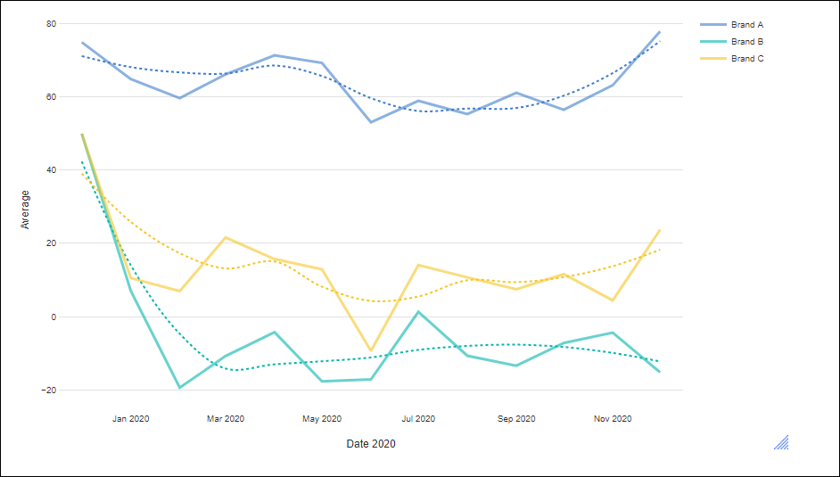
Using Time Series charts
We can create a similar chart using Time Series plots.
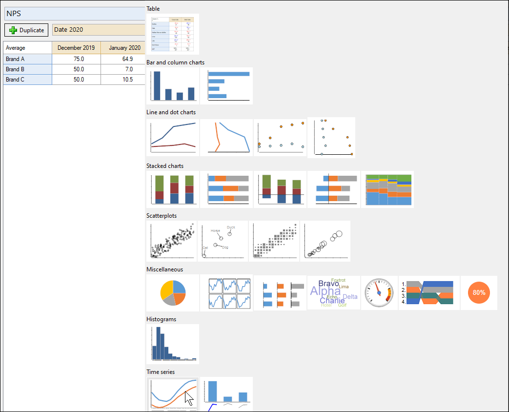
- Create a crosstab table For example:

- In the toolbar, click on the arrow next to Show Data as, which brings up a panel of charts.
- Select the Time Series plot (bottom right icon) automatically aggregates the data according to the first date variable in the data set, producing a time-series plot.
The results are as follows: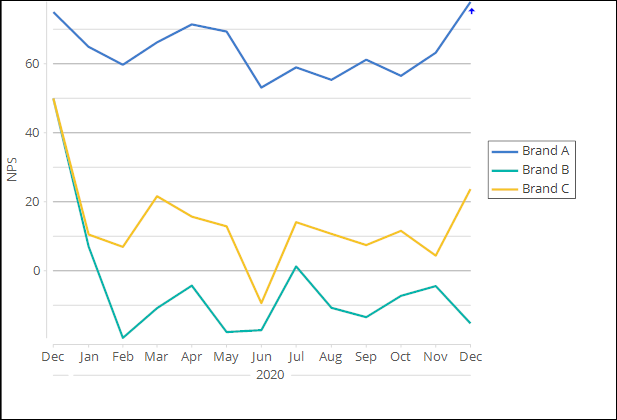
- On the panel on the right-hand side of the screen (below), expand the options for Time Series Analysis, to change the smoothness of the lines in the chart. Unlike the Visualization charts, the time series chart does not show the unsmoothed data.
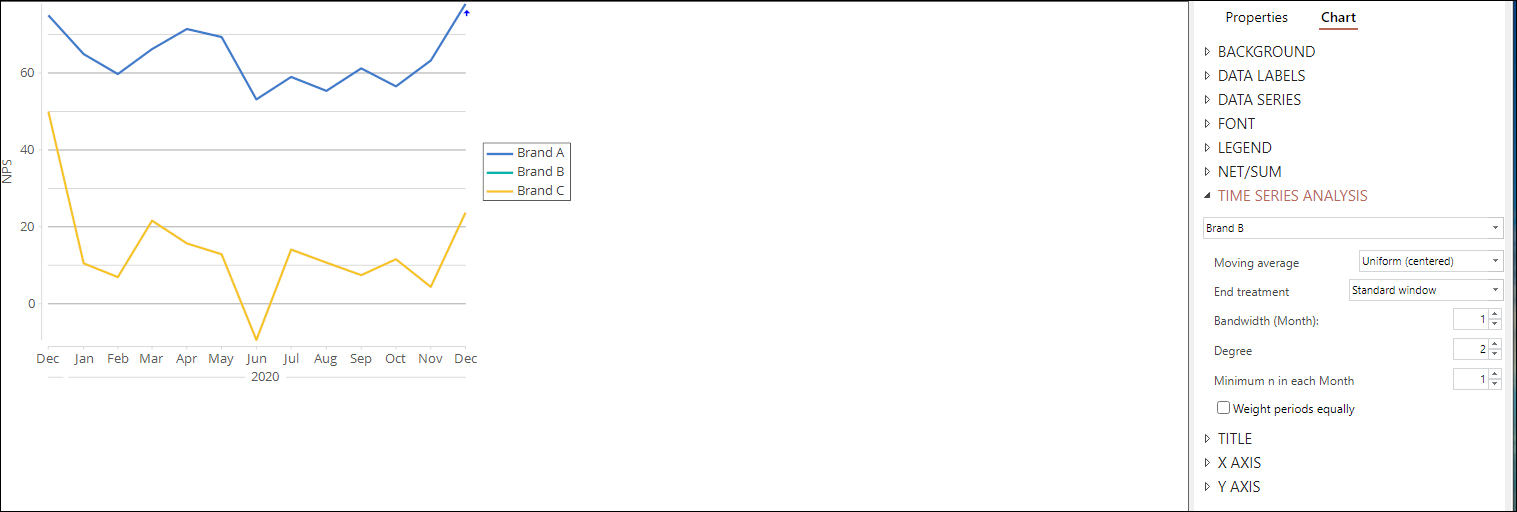
In the figure above, we changed the smoothing parameters to correspond to the LOESS defaults. That is, we used local quadratic regression (degree set to 2). We also used tri-cubic weights with a bandwidth of 7 data points. For this data set, these settings correspond to LOESS’s default bandwidth of 0.75 of the observed data.
NEXT
How to Create a Time Series Graph
How to Set Time Periods for Date Questions
How to Do Time Series Analysis in Q